Mapping diversity: an exploration of our social tapestry
These maps show, in a powerful way, the patterns of racial neighbourhood integration and segregation across South Africa’s largest cities.
Municipalities have become more racially integrated, according to a chapter in the recently released General Household Survey (GHS) report on housing1. However, the legacy of apartheid still has a hold on the social structure of South African urban space.
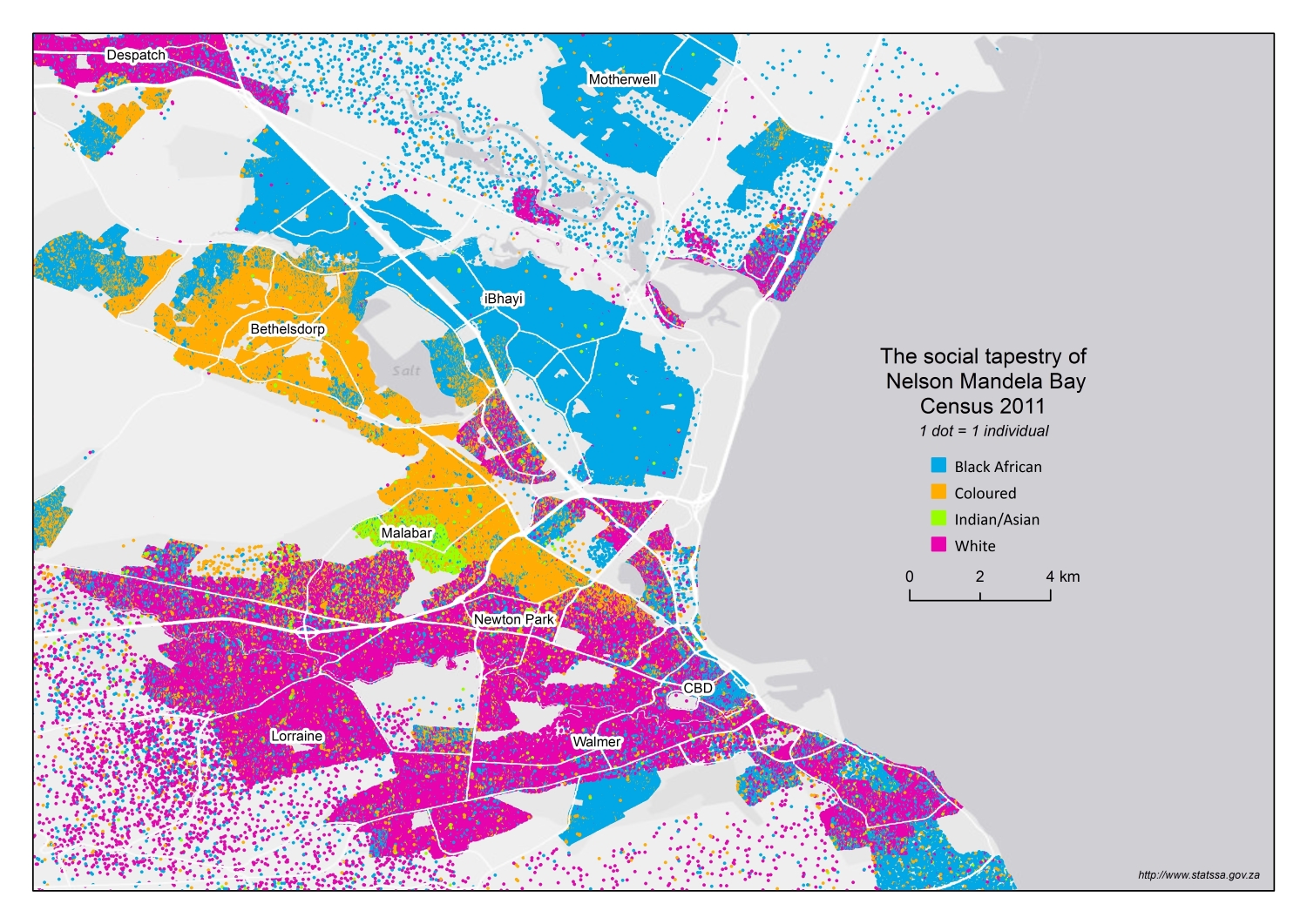
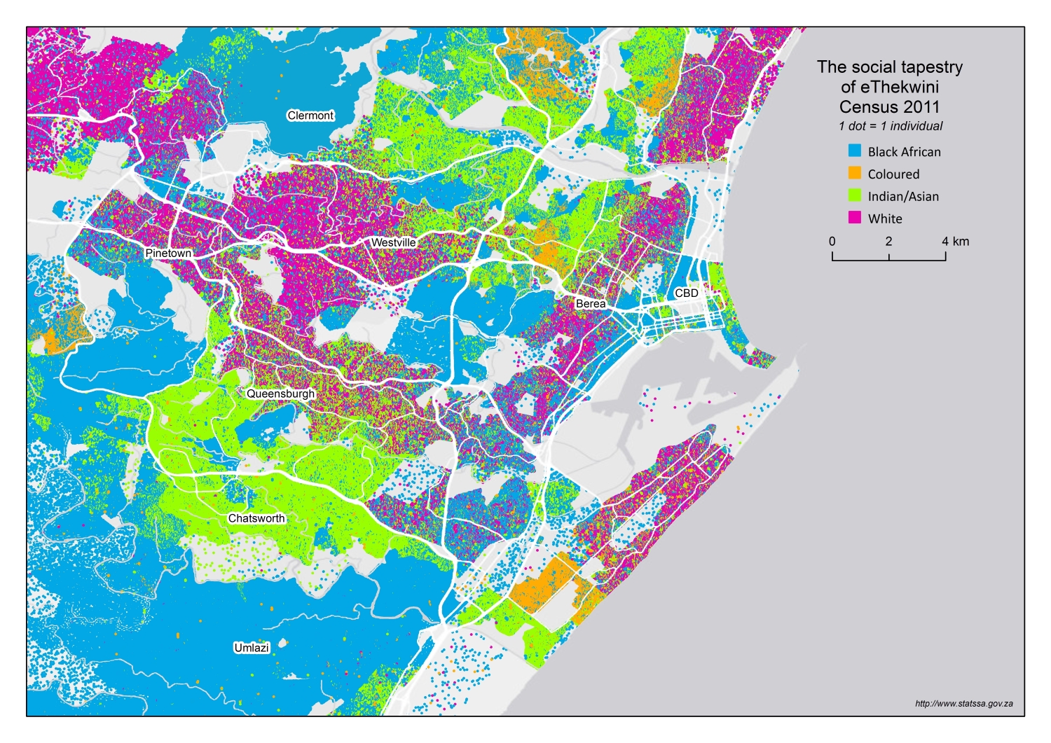
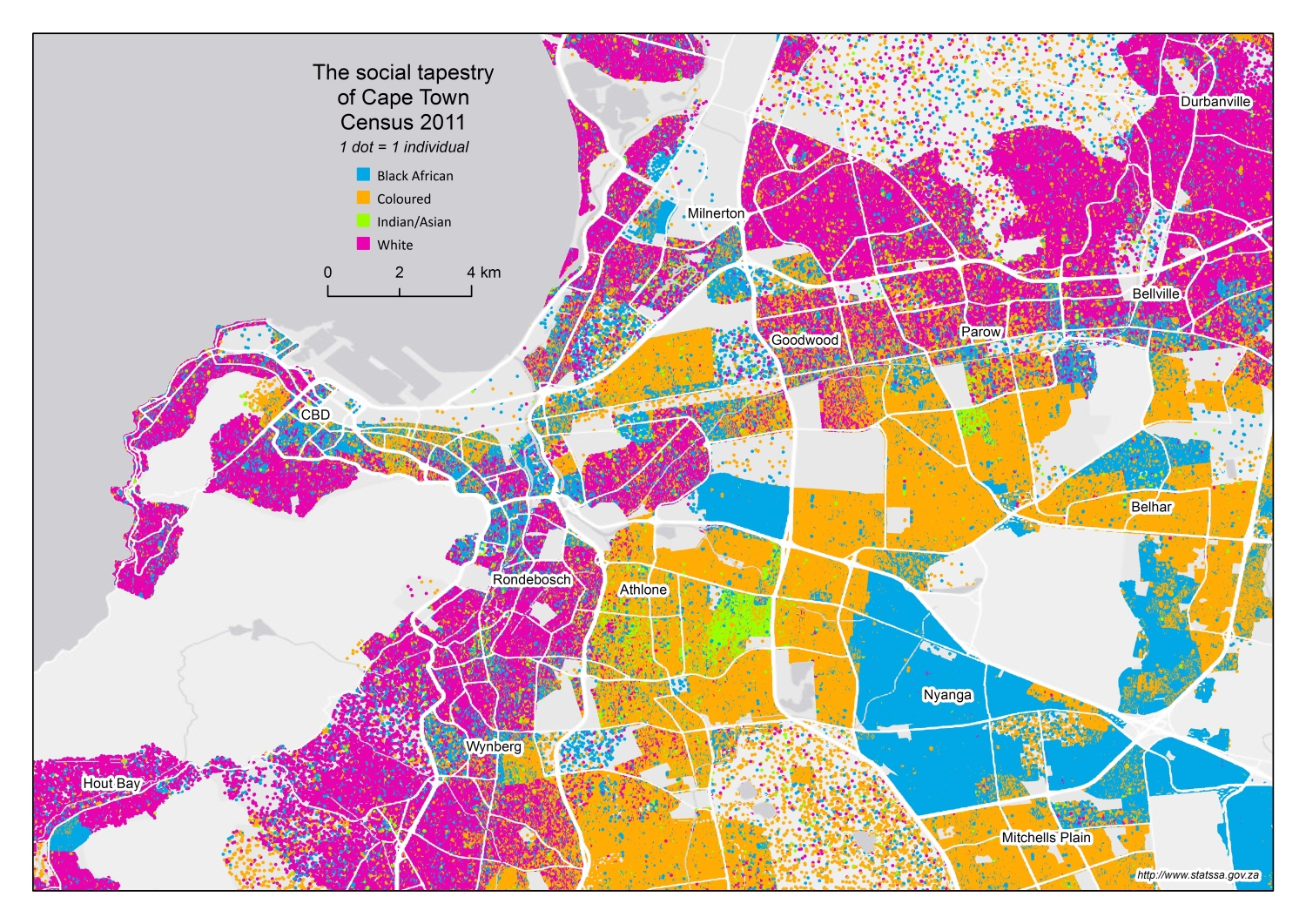
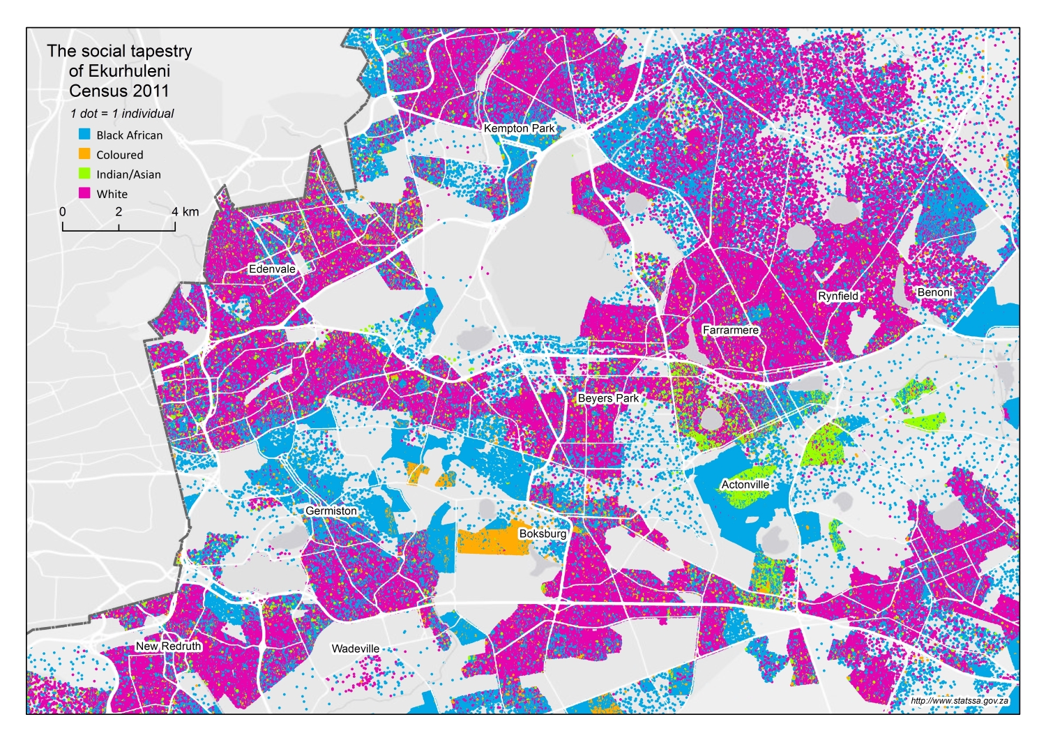
The scale below shows that Nelson Mandela Bay – which includes Port Elizabeth and Uitenhage – is the most segregated of the six largest municipalities, according to Theil’s entropy index applied to Census 2011 data2. Johannesburg is the least racially segregated.
Zero represents complete residential integration on the scale (i.e. the racial composition of all neighbourhoods in a city matches the racial composition of the city as a whole), and one represents complete segregation (i.e. all neighbourhoods are dominated by single race groups).
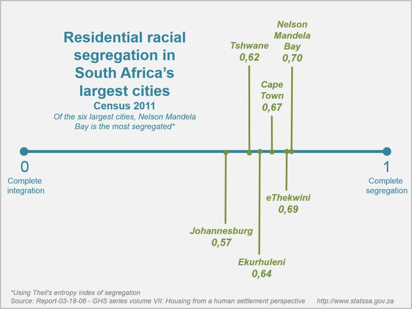
The Census Bureau in the United States applied the same index to Census 2000 data, listing Detroit as the most racially segregated city in that country, with a segregation index of 0,483. Even though South Africa’s largest cities have become more integrated since segregation laws were repealed in 1991 – as shown in Stats SA’s report – we still have a long way to go.
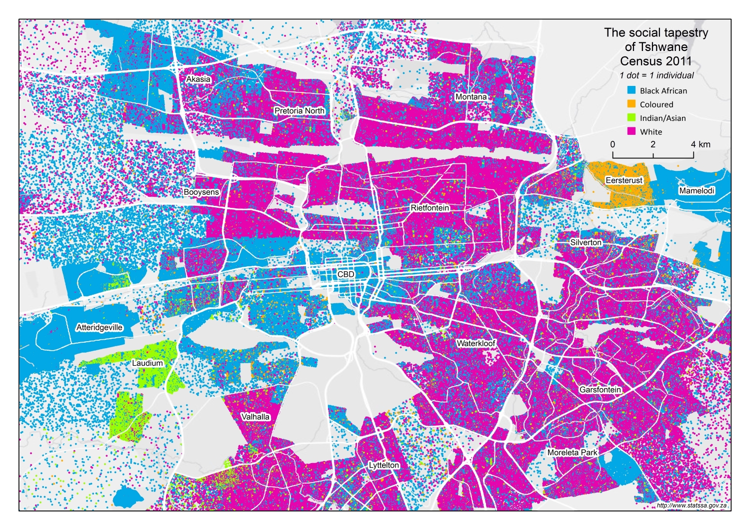
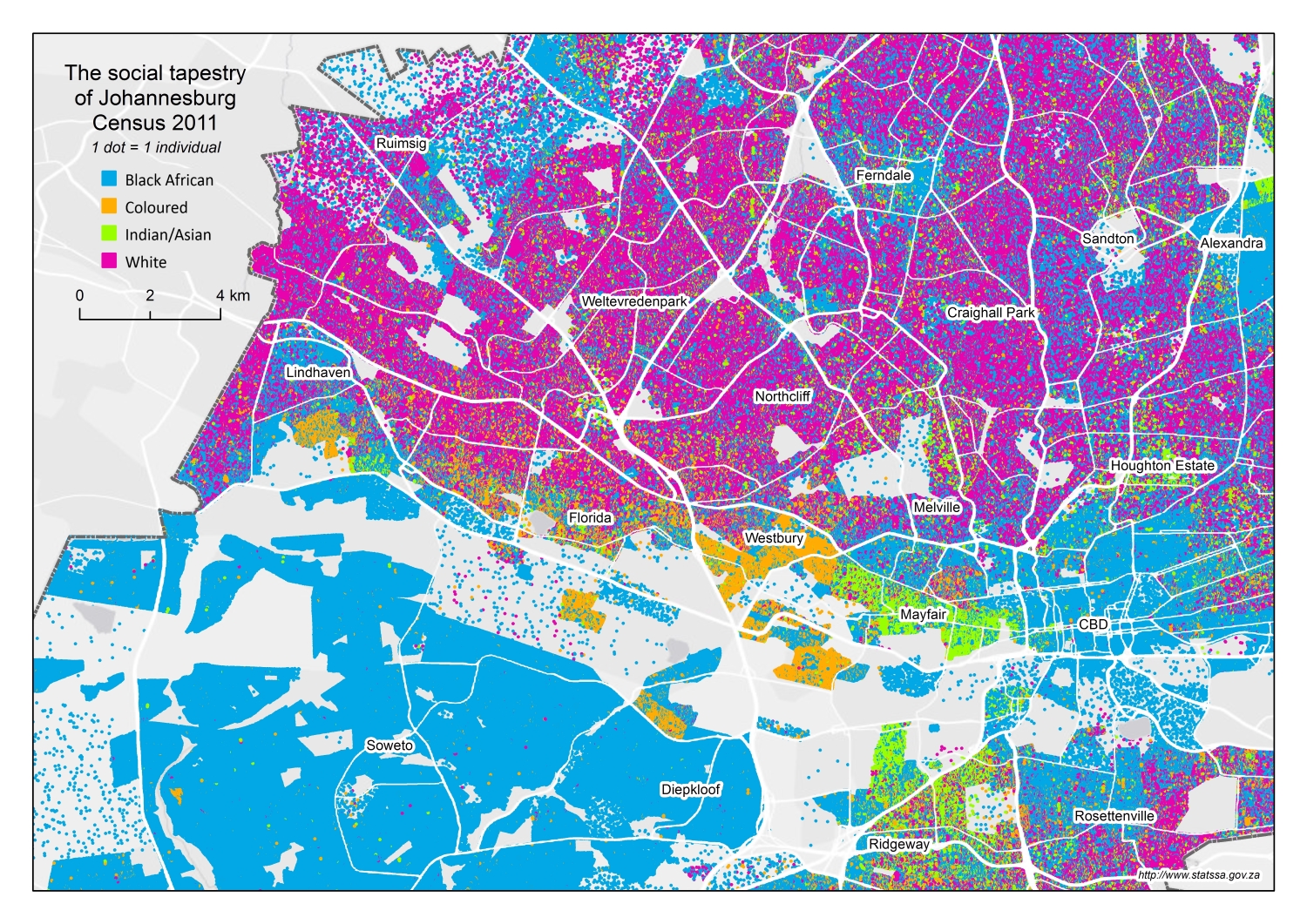
Now, to the maps. If you live in one of the six cities, take a close look at your city’s map below (click on the map to enlarge). Can you pinpoint where you live? Do you recognise the areas where racial integration is occurring, where the different coloured dots are mixing4?Mapping census data down to a neighbourhood level provides fascinating insights into a city’s social structure, as well as deeper understanding of what’s going on behind its segregation index5.
Interestingly, a number of general characteristics occur in nearly all the maps. Notice how:
- The central business districts (CBDs) have a high percentage of black African residents.
- The CBDs are surrounded by suburbs that have a high percentage of white residents.
- The high density townships – dominated by black African, coloured or Indian/Asian residents – are disconnected from the CBD.
- Racial mixing seems to be occurring mostly in previously white-dominated neighbourhoods.
Despite these common characteristics, each city still maintains its own unique pattern. A pattern which is not only a result of the city’s unique history, but also of its unique present.
1 For more information on residential segregation in South African municipalities, download the General Household Survey report here. https://www.statssa.gov.za/?page_id=1854&PPN=Report-03-18-06
2 If we look beyond the six largest cities and consider all 234 local municipalities, Overstrand municipality is the most racially segregated, according to the General Household Survey report.
3 http://www.census.gov/housing/patterns/about/multi-group.html
4 These maps were inspired by Bill Rankin’s work on Chicago. Click here to see more. http://www.radicalcartography.net/index.html?chicagodots
5 You might be wondering why we are using data that are five years old. Census 2011 is the latest dataset that South Africa has that provides demographic data down to street-block level for the entire country. Due to its high cost, a census takes place once every 10 years.